Capital Industrial
Capital Industrial is a material handling partner that takes projects all the way across the finish line, and then some. They work with dealers, integrators, suppliers, and realtors to handle everything from custom warehouse solutions to full-scale liquidations. With a hands-on approach and a team that thrives on solving complexity, Capital Industrial turns logistical challenges into streamlined, cash-positive outcomes. They came to BLB ready for a complete overhaul of how their brand shows up in the world.

Core Identity
At the heart of Capital Industrial is a boots-on-the-ground team that knows warehouses inside and out. But as we dug into their brand, it became clear they weren’t just serving one type of customer. There were the big players (dealers, integrators, and real estate pros) who leaned on Capital for complex projects and full-scale liquidations. And then there were the small business owners and farmers just looking for a few racks to organize their space. Two very different audiences, with different needs and totally different vocabularies. Rather than force a one-size-fits-all approach, we helped the team split the brand in two. Capital Industrial would keep its focus on wholesale clients and large-scale work, while a new B2C brand, Capital Rack & Shelving, would serve the smaller, more transactional side of the business.
With that clarity in place, we got to work defining what Capital Industrial stands for. We helped shape their Purpose, Vision, and Mission statements, grounding them in pragmatism, grit, and resourcefulness. Their Archetype landed squarely in the Hero space, a reflection of their get-it-done-at-all-costs mentality. And we crafted a set of brand values that spoke directly to how they show up in the field: honest, reliable, and relentlessly hands-on. These foundational pieces now guide everything from how the team talks about the work to how they evaluate new opportunities.


Verbal Identity
Capital Industrial doesn’t waste time - and neither does their voice. We developed a verbal identity that mirrors the way they actually work: straight-talking, no-nonsense, and built for action. Their tone is confident but never cocky, approachable without being casual, and always rooted in utility. It’s not about clever wordplay or fluffy jargon. It’s about clarity, trust, and saying what needs to be said, then getting to work.

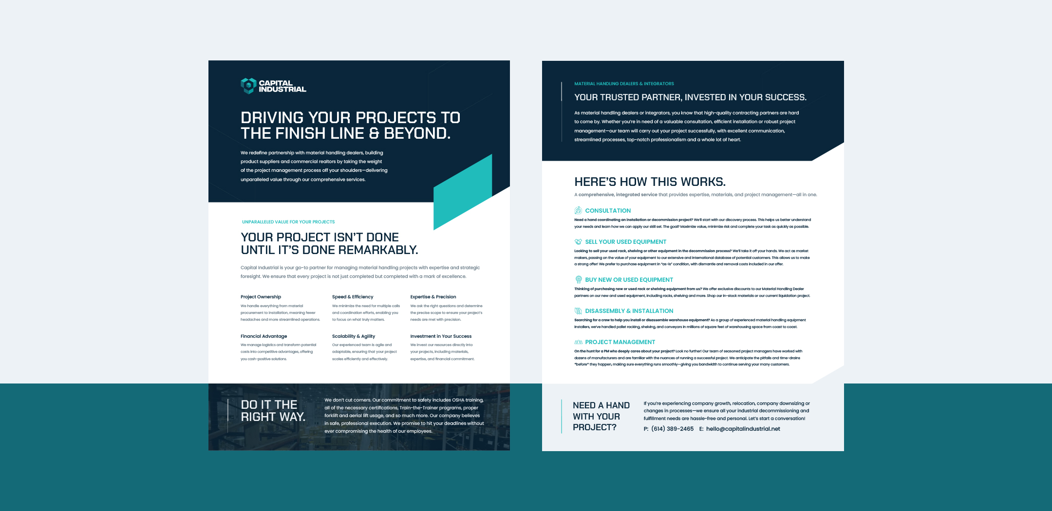
Visual Identity
Capital Industrial’s old logo, a grey box with “CI” inside, got the job done, but didn’t communicate much about who they were or where they were headed. We gave them a Visual Identity that does both. The new mark nods to the intersection of rack beams and uprights, with a central cube representing storage and structure. It’s clean, confident, and far more refined than anything else in their space. With an expanded color palette, updated type system, and a modern visual language, the brand now looks like the leader it is and leaves their competition looking like an afterthought.

Digital Identity
We built a fully custom WordPress site that’s easy to navigate, works seamlessly on every device, and speaks directly to Capital Industrial’s B2B audience. The site includes tailored solutions pages for each of their core user groups, plus real-world case studies that show how CI solves tough logistical challenges in the field. The crown jewel? A custom-built wholesale portal that gives returning clients instant access to real-time inventory and bulk pricing—automatically synced with CI’s actual warehouse stock. It’s a feature no one else in the industry offers, and it puts CI miles ahead in terms of service and transparency. The new site pairs perfectly with the refreshed brand, giving Capital Industrial a cohesive digital presence that looks as capable as they are. The results speak for themselves: the year after launch, they hit their highest revenue to date.